Monday, November 25, 2019

Aerial Photography and Remote Sensing - Module Lab 5 - Unsupervised & Supervised Classification

Hello Everyone!

It's hard to believe, but this week's lab is the final lab of this awesome remote sensing class before I start my final project! With that being said, this week's lab was a great way to end the labs for the semester! This week we covered supervised and unsupervised classification. Unsupervised classification essentially gives the user the power to select how the image is classified using pixel values that match across spectral classes. These classes can then be changed individually so when you change the class, all pixel values in that class change. Supervised classification essentially uses the image analyst to supervise the selection and creation of spectral classes within the program. By defining the areas of classification, it then can classify the image based on a handful of 'seeded' areas.

For this week's deliverable, I was tasked with using supervised classification to classify the landcover/use of Germantown, Maryland. For this exercise, I created 8 seeded areas of interest classification signatures that would serve as the classification seeds for my image. I then chose a band combination (within the map title) that caused the least amount of spectral confusion and then recoded my values. Once my image was complete, I added the new class names and area of each class in acres. Additionally, I added and created a Distance map which shows where areas of classification are likely incorrect. The brighter the area, the higher the chance that the classification of that feature was wrong.


I am really glad that everyone has been following me through this incredible journey in the world of remote sensing and aerial photography, it is truly one of the coolest fields of GIS and I would love to work on this for my capstone research!

~Map On!


Tuesday, November 19, 2019

Aerial Photography and Remote Sensing - Module Lab 4 - Spatial Enhancement, Multispectral Data, and Band Indices

Hello Everyone!

For this week's lab, I worked in ERDAS Imagine to manipulate and enhance various remote sensed images. This week's lab touched on various forms of image manipulation from band layer combinations of Red, Green, Blue which changes the image feature colors, the sharpening, and refining of edges in imagery, and identifying features based on their histogram and band information. Below you can see the example of one of the three features I was to identify. Each of the three features had specific values for pixel values, histograms, and criteria that make them unique. One of my examples can be seen below:

For this map, the feature I was looking for was described as a feature causing a small spike in pixel values within Layers 1-4 around 200 and a large spike between pixel values 9 and 11 in Layer 5 and 6. To determine this feature I first assessed the histogram for each of the 6 layers and then determined the spike areas. I then used the ERDAS Identifier tool to look at the suspected snow area to see if it met both pixel value criteria. When the feature was confirmed as correct, I chose the following band combination to help distinguish the snow cover in the image, Red: Layer 6, Green: Layer 5, and Blue: Layer 3. This causes the snow to appear blue and distinguish itself from the surrounding features. 

~Map On!

Tuesday, November 12, 2019

Aerial Photography and Remote Sensing - Module Lab 3 - Intro to ERDAS Imagine and Digital Data

Hello Everyone!

This week's lab was all about using ERDAS Imagine which is essentially an image processing software that allows users to manipulate and view various types of remotely sensed data and other aerial imagery. Additionally, ERDAS supports vector data. ERDAS grants a user to view multiple sensed images at once, modify their color spectrum and even layer various types of data in one frame. Through ERDAS this week we took a subset snapshot of a remotely sensed image of Washington State. We then pulled this image of types of landcover into ArcGIS pro and created a map set. Through ERDAS I was able to see the category names of each landcover type for each pixel and calculate the area that each type of land cover took up within the subset image. My map can be seen below: 


As you can see, there are 7 (6 present) types of class area land covers within my subset map image. Within the legend, you can see the acreages of those class areas calculated. For this class, we will be using ERDAS more which is a very powerful tool that I am looking forward to using!

~Map On!

Tuesday, November 5, 2019

Aerial Photography and Remote Sensing - Module Lab 2 - Land/Land Cover Classification and Ground Truth

Hello Everyone!

This week's lab was focused on Land Use and Land Cover Classification and Ground Truthing. Land Use can be defined as the way humans use the landscape. This landscape usage can range from residential to commercial to agriculture or industrial. Land Use is not the easiest to decipher from a satellite image. Land Cover, on the other hand, is the biophysical description of the surface of the earth. Land cover can range from water to forests or wetlands. These types of features are much easier to identify from a satellite image. For this lab, I was tasked with creating a Land Use and Land Cover map from a satellite image of a portion of Pascagoula, Mississippi. For every unique feature on the image at a working small scale, I digitized and created polygon boundaries for each of the various types of land cover and land uses. The map I created can be seen below:


For my map, I ended up with 12 unique land use and land cover classes. For the second part of my lab, I had to ground truth 30 test point locations and create an accuracy statement. Overall I had a visual interpretation accuracy value of 80% which means 80% of my deduced land cover and land use guesses were correct and my map has 80% accuracy. See you next week!

~Map On!

Wednesday, October 30, 2019

Aerial Photography and Remote Sensing - Module Lab 1 - Visual Interpretation

Hello Everyone!

This semester I am starting Aerial Photography and Remote Sensing. For this week's lab, I learned all about identifying various features and aspects of aerial images. I essentially had three primary exercises, I will show you the final maps for the first two and talk briefly about the third.

For the first exercise, I was able to distinguish two aspects of aerial photographs. Tone and Texture. The tone in an aerial image is how bright or how dark a section of an aerial image is while the texture is how smooth or how coarse a surface of the image area is. For this map, I selected 5 areas of tone (in red) that range from very light, light, medium, dark, and very dark. For texture, additionally, I selected 5 areas of texture (in blue) that ranged from very fine, fine, mottled coarse and very coarse. The results of my first map can be seen below:


For the second exercise, I distinguished aerial photography features based on four specific criteria: These criteria are a shadow, pattern, shape and size, and association. For shadow, I used the shadow of the object to identify features (such as a power pole). For shape and size, I used just that such as the shape and size of a vehicle. Pattern, I used identified clusters such as a cluster of buildings or trees, and for association I used a grouping and contextual location such as buildings with a big parking lot being a potential mall. 


Finally, for the third and final exercise, I picked points on a true-color image and compared them to the same locations on a false-color infrared image. This was a really cool exercise as true color locations showed up opposite as false-color (an example being a forest that is green in the true-color image and red in the false-color infrared image.

~Map On!

Tuesday, October 15, 2019

Special Topics in GIS - Module 3.1: Scale Effect and Spatial Data Aggregation

Hello Everyone!

It really is hard to believe, but here we are at the end of Special Topics in GIS, it has bee a great course and I have learned so much in the past 8 weeks. From data accuracy to spatial data assessment, we have covered so much this semester. For this final lab, we covered a huge topic that is very relevant in GIS today and that is the effect of scale on various types of data in addition to the Modifiable Areal Unit Problem and how it pertains to congressional district gerrymandering. I'd like to break down the effect of scale and resolution on the two types of spatial data: Vector and Raster.

When vector data is created at different scales there will obviously be a difference in detail of the data. For the lab, we were given multiple hydrographic features taken at three scales:

1:1200
1:24000
1:100000

At the 1:1200 scale, hydrographic lines and polygons can be expected to reflect the nature of the real world in the data. Polylines at this level will be very detailed and have a high number of vertexes. Polygons will be more inclusive in features.

At the 1:24000 scale, feature detail begins to drop. Polylines have less detail and shorter total lengths to account for the less number of features illustrated. Polygons drop off at this level of scale, and polygons compared to the 1:1200 scale are not accurate reflections of the features.

At the 1:100000 scale, data detail becomes even less than at the 1:24000 scale. Polylines are as minimal as possible with very little detail and polygons are missing even more since features are too small to draw by eye. The data very minimally reflects the real world.

For raster surface data, the difference in resolution can heavily impact the data. For this lab, I resampled a raster surface (1-meter cell size) DEM of a watershed surface feature at five different resolutions:

2-meter cell size
5-meter cell size
10-meter cell size
30-meter cell size
90-meter cell size

Using a bilinear sampling method designed specifically for this type of continuous data, with each resample to the next resolution size up, the quality of the raster surface decreased. Larger cell values did not reflect the values accurately of the initial 1-meter cell size values when calculating the average slope of each raster.

These two typed of spatial data with there issues point to a problem well known in the GIS world known as the Modifiable Areal Unit Problem. This 'problem' essentially arises when you create new boundaries to aggregate smaller features together into new areas. These 'new boundaries' are usually always arbitrary and in no way reflect the data of the smaller pieces within them and can be deceiving. A great modern GIS issue of this is Gerrymandering. Gerrymandering is a political strategy to redraw boundaries of districts so that they favor one particular political party or class. In the state of Florida, gerrymandering has been under the spotlight for some years. While gerrymandering is tough to measure by the human eye (with some exceptions), it can statistically be measured. Through a method called the Polsby-Popper Score, congressional district compactness can be measured. This value is calculated by multiplying the area of the district by 4pi and then dividing that number by the perimeter squared of the district. The values returned can range from a value of 0 to 1. Values closer to 1 reflect districts that are more compact while values closer to 0 reflect districts that are very 'loose'. The looser the district, the higher the likelihood it has been gerrymandered.

Below is the district (in red) that received the lowest Polsby-Popper Score value of 0.029


I hope you have enjoyed keeping up with my learning this semester. Next semester I will be taking on Advanced Topics in GIS and Remote Sensing. I look forward to sharing these next moments with you and as always...

~Map On!


Wednesday, October 9, 2019

Special Topics in GIS - Module 2.3: Surfaces - Accuracy In DEMs

Hello Everyone!

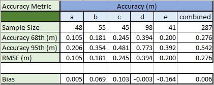
This week's lab focused all on assessing the vertical accuracy of DEMs. For the lab this week I analyzed the vertical accuracy of a DEM of river tributaries within North Carolina. To assess the DEM's vertical accuracy, I was given reference point data taken by high accuracy surveying equipment. The 287 reference points were taken at five various landcover type locations. These land cover types are as follows:


  • A - Bare Earth/Low Grass
  • B - High Grass/Weeds/Crops
  • C - Brushland/Low Trees
  • D - Fully Forested
  • E - Urban
To assess the vertical accuracy of the DEM I extracted the elevation values from each cell that where each reference survey point fell. Now that I had the actual elevation points and a set of reference points for each actual value, I could compare the results. To assess accuracy, I calculated 4 statistical numbers for each land cover type and the dataset as a whole. My four statistical numbers included accuracy at the 68th percent confidence interval, the accuracy at the 95th percent confidence interval, the RMSE (Root Mean Square Error), and the Bias (Mean Error). The Root Mean Square Error is the most used metric to assess and calculate accuracy. Higher RMSE values mean lower accuracy and lower RMSE values mean higher accuracy. My results can be seen below.


For my analysis, the Bare Earth has the highest accuracy with the fully forested land cover having the lowest. This is no surprise as creating a digital elevation model of the varying land cover of the earth's surface can be quite challenging since various land cover types can vary in terms of accuracy. 

~Map On!