Wednesday, October 30, 2019

Aerial Photography and Remote Sensing - Module Lab 1 - Visual Interpretation

Hello Everyone!

This semester I am starting Aerial Photography and Remote Sensing. For this week's lab, I learned all about identifying various features and aspects of aerial images. I essentially had three primary exercises, I will show you the final maps for the first two and talk briefly about the third.

For the first exercise, I was able to distinguish two aspects of aerial photographs. Tone and Texture. The tone in an aerial image is how bright or how dark a section of an aerial image is while the texture is how smooth or how coarse a surface of the image area is. For this map, I selected 5 areas of tone (in red) that range from very light, light, medium, dark, and very dark. For texture, additionally, I selected 5 areas of texture (in blue) that ranged from very fine, fine, mottled coarse and very coarse. The results of my first map can be seen below:


For the second exercise, I distinguished aerial photography features based on four specific criteria: These criteria are a shadow, pattern, shape and size, and association. For shadow, I used the shadow of the object to identify features (such as a power pole). For shape and size, I used just that such as the shape and size of a vehicle. Pattern, I used identified clusters such as a cluster of buildings or trees, and for association I used a grouping and contextual location such as buildings with a big parking lot being a potential mall. 


Finally, for the third and final exercise, I picked points on a true-color image and compared them to the same locations on a false-color infrared image. This was a really cool exercise as true color locations showed up opposite as false-color (an example being a forest that is green in the true-color image and red in the false-color infrared image.

~Map On!

Tuesday, October 15, 2019

Special Topics in GIS - Module 3.1: Scale Effect and Spatial Data Aggregation

Hello Everyone!

It really is hard to believe, but here we are at the end of Special Topics in GIS, it has bee a great course and I have learned so much in the past 8 weeks. From data accuracy to spatial data assessment, we have covered so much this semester. For this final lab, we covered a huge topic that is very relevant in GIS today and that is the effect of scale on various types of data in addition to the Modifiable Areal Unit Problem and how it pertains to congressional district gerrymandering. I'd like to break down the effect of scale and resolution on the two types of spatial data: Vector and Raster.

When vector data is created at different scales there will obviously be a difference in detail of the data. For the lab, we were given multiple hydrographic features taken at three scales:

1:1200
1:24000
1:100000

At the 1:1200 scale, hydrographic lines and polygons can be expected to reflect the nature of the real world in the data. Polylines at this level will be very detailed and have a high number of vertexes. Polygons will be more inclusive in features.

At the 1:24000 scale, feature detail begins to drop. Polylines have less detail and shorter total lengths to account for the less number of features illustrated. Polygons drop off at this level of scale, and polygons compared to the 1:1200 scale are not accurate reflections of the features.

At the 1:100000 scale, data detail becomes even less than at the 1:24000 scale. Polylines are as minimal as possible with very little detail and polygons are missing even more since features are too small to draw by eye. The data very minimally reflects the real world.

For raster surface data, the difference in resolution can heavily impact the data. For this lab, I resampled a raster surface (1-meter cell size) DEM of a watershed surface feature at five different resolutions:

2-meter cell size
5-meter cell size
10-meter cell size
30-meter cell size
90-meter cell size

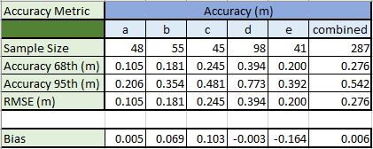
Using a bilinear sampling method designed specifically for this type of continuous data, with each resample to the next resolution size up, the quality of the raster surface decreased. Larger cell values did not reflect the values accurately of the initial 1-meter cell size values when calculating the average slope of each raster.

These two typed of spatial data with there issues point to a problem well known in the GIS world known as the Modifiable Areal Unit Problem. This 'problem' essentially arises when you create new boundaries to aggregate smaller features together into new areas. These 'new boundaries' are usually always arbitrary and in no way reflect the data of the smaller pieces within them and can be deceiving. A great modern GIS issue of this is Gerrymandering. Gerrymandering is a political strategy to redraw boundaries of districts so that they favor one particular political party or class. In the state of Florida, gerrymandering has been under the spotlight for some years. While gerrymandering is tough to measure by the human eye (with some exceptions), it can statistically be measured. Through a method called the Polsby-Popper Score, congressional district compactness can be measured. This value is calculated by multiplying the area of the district by 4pi and then dividing that number by the perimeter squared of the district. The values returned can range from a value of 0 to 1. Values closer to 1 reflect districts that are more compact while values closer to 0 reflect districts that are very 'loose'. The looser the district, the higher the likelihood it has been gerrymandered.

Below is the district (in red) that received the lowest Polsby-Popper Score value of 0.029


I hope you have enjoyed keeping up with my learning this semester. Next semester I will be taking on Advanced Topics in GIS and Remote Sensing. I look forward to sharing these next moments with you and as always...

~Map On!


Wednesday, October 9, 2019

Special Topics in GIS - Module 2.3: Surfaces - Accuracy In DEMs

Hello Everyone!

This week's lab focused all on assessing the vertical accuracy of DEMs. For the lab this week I analyzed the vertical accuracy of a DEM of river tributaries within North Carolina. To assess the DEM's vertical accuracy, I was given reference point data taken by high accuracy surveying equipment. The 287 reference points were taken at five various landcover type locations. These land cover types are as follows:


  • A - Bare Earth/Low Grass
  • B - High Grass/Weeds/Crops
  • C - Brushland/Low Trees
  • D - Fully Forested
  • E - Urban
To assess the vertical accuracy of the DEM I extracted the elevation values from each cell that where each reference survey point fell. Now that I had the actual elevation points and a set of reference points for each actual value, I could compare the results. To assess accuracy, I calculated 4 statistical numbers for each land cover type and the dataset as a whole. My four statistical numbers included accuracy at the 68th percent confidence interval, the accuracy at the 95th percent confidence interval, the RMSE (Root Mean Square Error), and the Bias (Mean Error). The Root Mean Square Error is the most used metric to assess and calculate accuracy. Higher RMSE values mean lower accuracy and lower RMSE values mean higher accuracy. My results can be seen below.


For my analysis, the Bare Earth has the highest accuracy with the fully forested land cover having the lowest. This is no surprise as creating a digital elevation model of the varying land cover of the earth's surface can be quite challenging since various land cover types can vary in terms of accuracy. 

~Map On!

Thursday, October 3, 2019

Special Topics in GIS - Module 2.2: Surface Interpolation

Hello Everyone!

This week's lab was all about interpolation methods for surface data. Interpolation of spatial data is essentially assigning values across surface data at unmeasured/unvalued locations based on the values at measured/values sampling locations. During this lab, I worked with three primary forms of surface data interpolation. Thiessen Polygons, IDW or Inverse Distance Weight and Spline Interpolation. For the Spline interpolation method, there are two types of Spline Interpolation: Regular and Tension.

For this week's lab I worked in two parts. For part A, I compared Spline and IDW interpolation to create a Digital Elevation Model. While this part of the lab and assessing the differences between the two data methods was interesting, I'm going to share with you Part B. For Part B, I was provided 41 sample station water quality measurement points sampled in Tampa Bay, Florida. These data points essentially focus on the water quality and specifically the Biochemical Oxygen Demand (mg/L) at each sample.

Thiessen Polygons

The Thiessen Polygon interpolation method is fairly straight forward. Thiessen polygons contruct polygon boundaries where the value throughout the polygon is equal to the value of the sample point. Overall this method is fairly simple and widely used but for the nature of water quality data, the drastic shifts in polygon values and their clunky look do not reflect the data.

IDW (Inverse Distance Weight)

This method is much better for the nature of the data I was interpolating. Essentially, the values associated with the points directly affect the interpolation while the value decreases the further it gets away from the points. Points that are clustered together tend to push the overall data distribution higher in the clustered areas of concentration. For this data, this method still felt too clunky and did not reflect water quality.

Spline (Regular and Tension)

Spline Interpolation, the smoothest method employed in this lab essentially tries to smoothly go through the data sample points while reducing the curvature of the surface data. Regular spline interpolation is much more dynamic with value ranges (I had negative values even though my data contained none) with lower lows and higher highs. Tension spline interpolation attempts to reduce the factor of data values outside the initial range. For the nature of the data, I believe that Tension spline interpolation (Below) is the best method to visualize the surface data. Water is a smooth continuous medium and water quality can change constantly. Interpolation of this quality of data needs to be loose, but not exceed the data itself making tension spline interpolation the best method for this week.


~Map On!

Thursday, September 26, 2019

Special Topics in GIS - Module 2.1: Surfaces - TINs and DEMs

Hello Everyone!

This weeks lab is one of my favorite labs so far that I've done in my special topics GIS class. For this weeks lab, it was all about working with surface data. When working with surface data in GIS, there are two main types of surface data TINs (Triangular Irregular Networks) and DEMs (Digital Elevation Models). TINs are a vector-based surface data type that uses vertices distributed across the surface to draw triangular edge lines that connect these vertices together. None of these triangle surfaces overlap and you can find that they can better visualize surfaces that vary greatly compared to surfaces that have little to no variance. DEMs share some similarities with TINs, like TINs, DEMs are a great way to visualize a continuous surface. Unlike TINs, DEMs are a raster-based surface data type that uses elevation points within a series of grid cells. These cells can range anywhere from one meter to fifty meters in size. Each cell in the DEM has a unique value. Compared to TINs a digital elevation model is much smoother in showing the surface data while the DEM is much more geometric. While TINs and DEMs are different in the way they visualize surface data, there are a variety of useful functions that they can both do. You can symbolize these two types of surface data in various ways from elevation to slope and aspect values. With this surface data, you can also create contour lines. Below you can see the differences between a TIN and a DEM.

Slope Symbology (DEM)

Aspect Symbology (DEM)

Slope with Contours (TIN)

I could write pages about TINs and DEMs and all the practical and unique uses they have. Before I wrap up this weeks blog, I would like to share with you a DEM project that I worked on this past year that showcases the beauty of working with the aforementioned surface data types. 


For this project, I used a LiDAR (Light Detection and Ranging) image (Top) of the surface of Crater Lake in Oregon taken via remote sensing. Crater Lake almost fills a ~2,200 ft deep caldera that formed roughly 7,700 years ago when the volcano Mount Mazama collapsed. It is the deepest lake in the United States with a depth of 1,949 feet and ranks as the ninth deepest rank in the world. From the LiDAR image, I created a hillshade which is essentially a grayscale representation of the earth's surface in 3D that takes into account the position of the sun to shade the terrain. Once my hillshade was created, I overlayed the original LiDAR image and symbolized it by elevation (cool colors low, warm to gray colors high). I then added bathymetry data to show the depth of the lake. I hope you have enjoyed this weeks lab material, working with surface data is one of the coolest GIS applications! 

~Map On!

Wednesday, September 18, 2019

Special Topics in GIS - Module 1.3: Data Quality - Assessment

Hello Everyone!

For this weeks lab, we focused on the assessment of data. The lab that I will be sharing with you this week was all about comparing the completeness of two different road shapefiles in the state of Oregon. For this lab, the first level of assessment was comparing the overall completeness of each road dataset by comparing the sum values. Out of the two road datasets I was given (TIGER Lines and Jackson County, OR Centerlines) the TIGER lines are more complete from by over 500 kilometers. Once the overall completeness assessment had been completed, I was then tasked with assessing completeness within a grid. This task would essentially take a grid of 297 cells and compare the total length of roads within each cell. To find these values, I used a tool in ArcGIS Pro called 'Summarize Within'. This tool essentially allows you to find out various levels of information regarding features within other features. In this case, I was looking at the sum of roads for both datasets within each grid. Before I could run my analysis, I needed to clean up the data a little. The TIGER Lines were in a different projection system that the rest of my data, so I reprojected them to match the other data. I also needed to clip my road features to the extent of my grid so that no roads would be outside my study area. I then ran my summarize within to get the sum of road segments in each cell. Finally, I needed to find the percentage of completion for each cell. To achieve this, I used a standard percent difference calculation that gave me both a positive and a negative percentage. Below is the map of my data without the roads to avoid excess map clutter:


As you can see on my map, there are both grid values of positive and negative percentage values. Areas with positive percentages increasing along the blue color ramp portion indicate cells where the sum of the County Center Line roads is greater than the sum of the TIGER Lines (higher percentage completion of County than TIGER). Cells that move up the red portion into the negative percentages indicate cells that have a greater sum of TIGER Line roads compared to the sum of the County Center Line roads (higher percentage completion of TIGER than County). Within this data, it should also be noted that there are two specific grids that are special. There is one cell that contains no roads for either of the datasets and is marked as gray with a 'No Data' attribute. Second, there is one cell (darkest red) where TIGER lines are 100% completion because there is no County road data within that cell.

Saturday, September 7, 2019

Special Topics in GIS - Module 1.2: Data Quality - Standards

Hello Everyone!

This weeks lab is an extension of Spatial Data Quality. For this weeks lab, I did my data quality assessment according to the National Standard for Spatial Data Accuracy (NSSDA). According to the NSSDA, some criteria need to be met when selecting test points. For this lab, I was given two road datasets. One data set is Albuquerque streets from the city of Albuquerque. The second road dataset is Albuquerque streets from StreetMap USA which is distributed from ESRI. Finally, I was provided several satellite aerial images of the study area portion of Albuquerque divided into quadrangles. When comparing the road datasets to the satellite aerial images, it was evident that on the surface, the two datasets had very differing positional accuracy from each other. For my positional accuracy analysis, I chose 20 randomly selected intersection points within one of the provided aerial image quadrangles of Albuquerque. Proper intersections that I chose for analysis were cross(+) intersections and right angle '90-degree' 'T' intersections. Per the NSDAA standards, my test points had a distribution of at least 20 percent of points in each quadrant of my aerial quadrangle and at least 10 percent spacing (at least 370 feet apart) distance of the diagonal length of the quadrangle. To select these points, I created intersection points for both road datasets using a geoprocessing tool within ArcGIS Pro. I then selected the random test points at the appropriate type of intersection ensuring to select the correct intersection for both road datasets and following the aforementioned NSDAA distribution/spacing rules. My test points can be seen below for one of the road datasets:


Once my test points had been selected, I then digitized reference points to compare the positional accuracy bases on the aerial satellite imagery location of each intersection. Once the test points and reference points were created, test points were assigned matching Point IDs with the reference points so their coordinate values could easily be analyzed. After assigning XY coordinate values to both sets of test points and my reference points, I exported them as DBF files and then plugged them into a positional accuracy spreadsheet provided by the NSSDA that calculates the positional accuracy using the 95th percentile. Essentially the table compares the XY position of each test point to its matching reference point (the importance of matching Point IDs for both test points and reference point). This sheet calculated the following values. Sum, Mean, Root Mean Square Error (RMSE), and the National Standard for Spatial Data Accuracy statistic which multiplies the RMSE by a value of 1.7308 (95th Percentile for Horizontal Accuracy) to yield the horizontal positional accuracy at the 95th percentile. My formal accuracy statements can be found below that meet the NSSDA guidelines:

ABQ Streets Test Points:
Horizontal Positional Accuracy: Tested 14.106 feet horizontal accuracy at 95% confidence level.
Vertical Positional Accuracy: Not applicable

Street Map USA Test Points:
Horizontal Positional Accuracy: Tested 258.682 feet horizontal accuracy at 95% confidence level.
Vertical Positional Accuracy: Not applicable

I genuinely enjoyed working through this weeks lab and look forward to sharing more special topics with you and as always... ~Map On!